The most authentic stage environments are achieved not by adding more detail, but by a ruthless process of narrative curation and subtraction.
- A cluttered set overloads an audience’s cognitive capacity, obscuring the story instead of supporting it.
- Every object, surface, and texture must function as a silent actor, carrying emotional weight and character history.
Recommendation: Shift your focus from historical replication to emotional translation. Question every prop: does it serve the character’s narrative, or is it merely decoration?
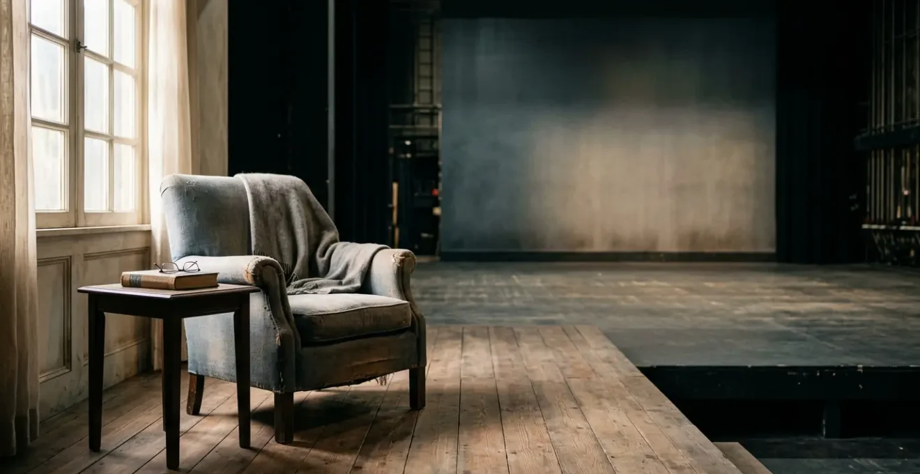
There is a particular kind of creative paralysis familiar to every set designer. You’ve spent weeks researching, sourcing, and arranging. The period details are perfect, the furniture is authentic, the dressing is meticulous. Yet, under the stage lights, the space feels inert. It’s a flawless historical recreation, but it has no soul. It’s a showroom, not a home; a museum exhibit, not a crucible for drama. The common advice—to obsess over detail, to be faithful to the period—often leads us directly to this sterile outcome.
The truth is, this problem isn’t solved by adding more. It’s solved by understanding what to take away. It requires moving beyond the role of a decorator to that of a storyteller, a psychologist, and a poet of space. The challenge isn’t just to build a room, but to build the *residue* of a life lived within it. This requires a shift in perspective, from accumulation to curation. It demands we consider the emotional language of materials, the narrative power of empty space, and the subtle ways light interacts with a surface.
This is where distinguished production design separates itself from competent set dressing. It’s a discipline rooted in a critical, atmosphere-focused approach. The key isn’t found in simply replicating reality, but in distilling it. It’s about learning to translate a director’s abstract emotional notes into tangible, buildable choices that resonate with an audience on a subconscious level. An authentic set doesn’t just show us where the characters are; it shows us *who* they are.
This guide deconstructs that process, moving from the macro-philosophy of subtraction to the micro-details of surface texture. We will explore how to make pragmatic budget decisions, avoid common technical errors, and embrace new technologies not as spectacle, but as powerful narrative tools.
Summary: A Guide to Creating Transformative Stage Environments
- Why Does Removing 70% of the Props Make a Set Feel More Real?
- How to Translate a Director’s Vague Emotional Brief into Buildable Design Elements?
- Flats and Paint vs Projections: Which Creates More Impact for £15,000?
- The Balcony Sightline Nobody Checked Until Technical Rehearsal
- When to Finalise the Model Box: Before or After Blocking Rehearsals Begin?
- How to Redesign a Windsor Chair so It Fits a Scandinavian-Style Living Room?
- Why Does a Hand-Planed Surface Reflect Light Differently Than Machine-Sanded Wood?
- Why Are West End Producers Now Hiring Robotics Engineers Alongside Choreographers?
Why Does Removing 70% of the Props Make a Set Feel More Real?
The impulse to fill a naturalistic set with objects is understandable. We equate detail with authenticity. Yet, paradoxically, this accumulation is often what makes a space feel artificial. The core issue is one of cognitive load. A stage overflowing with visual information forces the audience’s brain to work overtime, processing clutter rather than focusing on character and story. True realism is not about volume; it’s about the narrative significance of what remains. Removing the superfluous 70% of props allows the crucial 30% to speak with greater clarity and power.
This isn’t just an artistic theory; it’s grounded in cognitive science. Overwhelming an audience with non-essential stimuli creates a « split-attention effect, » where their focus is divided between the action and the environment. As research on cognitive load theory demonstrates, minimalist approaches that strip away unnecessary elements enable people to concentrate on key activities without distraction. On stage, this means every remaining object—a single teacup, a worn-out book, a fraying rug—becomes imbued with meaning. It ceases to be a prop and becomes an extension of the character.
This process of radical subtraction is what I call ‘narrative curation.’ It is the most critical skill a designer can develop. It involves asking a series of ruthless questions for every item considered: Does this object reveal a character’s past? Does it foreshadow a future event? Does its state of repair or disrepair reflect their inner world? If the answer is no, it doesn’t belong on stage. A sparse, thoughtfully curated set gives the audience’s imagination room to breathe and invites them to fill in the gaps, creating a far more personal and profound sense of reality than a perfectly cluttered room ever could.
How to Translate a Director’s Vague Emotional Brief into Buildable Design Elements?
A director’s brief is often a collection of feelings, not instructions. You’ll hear words like ‘oppressive’, ‘fragile’, ‘cold’, or ‘decaying’. The designer’s task is to act as a translator, converting this abstract emotional language into a physical, buildable reality. This translation process begins not with objects, but with the fundamental elements of design: texture, line, mass, and colour. An ‘oppressive’ room might be translated into a design with a lowered ceiling, heavy vertical lines that press downwards, and a palette of dark, light-absorbing colours.
This is the practice of ’emotional materiality’. It’s the understanding that different materials have an inherent sensory and psychological impact. Rough, unfinished wood feels raw and honest; cold, polished steel feels clinical and unforgiving; worn velvet feels nostalgic and comfortable. Before selecting a single piece of furniture, you should assemble a mood board of textures and materials. How does the splintered grain of a plank feel versus the smooth, anonymous surface of laminate? These choices form the subconscious bedrock of the set’s atmosphere, communicating the play’s emotional state to the audience long before an actor speaks a word.
The image below is a metaphor for this process. It shows how abstract feelings are methodically converted into a vocabulary of physical materials—from rough wood to cold metal, from desaturated blues to warm ambers. This is how a vague feeling becomes a tangible world.
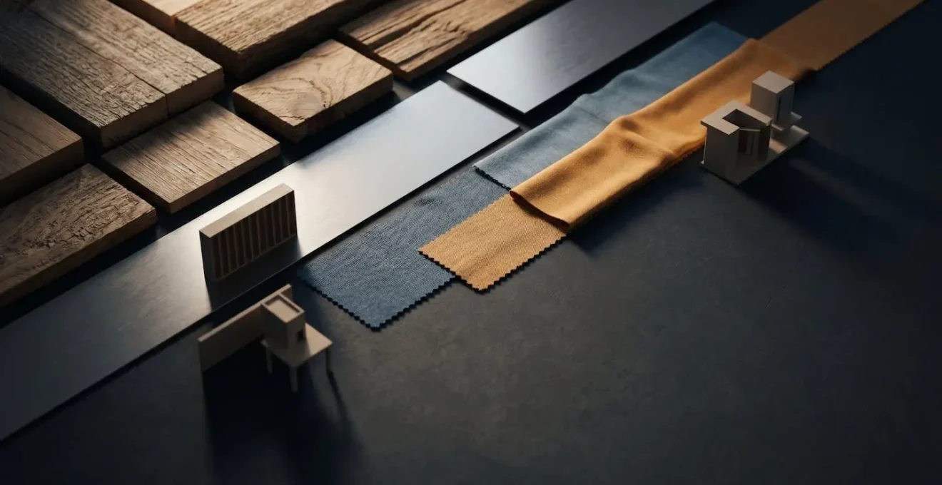
Ultimately, a successful translation is about creating a unified sensory world. A ‘fragile’ world might be built from thin, spindly furniture, translucent fabrics, and a lighting design that makes objects appear brittle. The key is to move past literal interpretations. ‘Decay’ isn’t just about peeling paint; it could be a floor that subtly slopes, a chair with one leg slightly shorter than the others, or a persistent, off-key colour that makes the entire room feel ill. By building a consistent language of these elements, the set becomes an active participant in the storytelling, reinforcing the director’s emotional vision at every moment.
Flats and Paint vs Projections: Which Creates More Impact for £15,000?
With a mid-range budget, the choice between traditional scenic art and digital projections is a critical one. It’s a decision between tangible presence and dynamic flexibility. For £15,000, you can afford high-quality painted flats that offer rich texture and a solid, grounded reality. Or, you can invest in a projector and content that can transform a space in an instant. Neither is inherently better; the right choice depends entirely on the narrative demands of the production.
Traditional flats and paint offer ’emotional materiality’ in its most direct form. A beautifully painted brick wall has a texture and depth that light can interact with in a way a projection cannot replicate. It has physical weight and permanence, which is ideal for plays grounded in a single, unchanging location where the environment itself is a character. The limitation, of course, is its static nature. Scene changes are manual, slow, and often require a full blackout, which can disrupt the dramatic flow. The impact is deep, but singular.
Projections, on the other hand, offer unparalleled versatility. They allow for instantaneous scene changes, the creation of impossible architectures, and the subtle introduction of movement and animation into the background. For a multi-location play or one with a fluid, dreamlike quality, they are transformative.
Case Study: The Cost-Effectiveness of Scenic Projections
Companies like Broadway Media have demonstrated significant cost savings and artistic benefits with their scenic projection packages. By replacing expensive and cumbersome physical backdrops with digital scenery, productions can eliminate rental and transport costs. More importantly, their systems allow for seamless, animated scene changes without blackouts, maintaining narrative momentum. This approach delivers high-production-value visuals for a fraction of the cost and logistical effort of traditional set construction, democratising access to dynamic, Broadway-style scenic effects.
The deciding factor should be storytelling. Does the play need the grounded, tactile reality of a physical object, or does it benefit from the fluid, ephemeral, and transformative power of light? For £15,000, you must choose your primary tool. Often, the most powerful designs use a hybrid approach: solid, textural architectural elements in the foreground, with projections used on a back wall or cyc to establish the shifting world beyond.
The Balcony Sightline Nobody Checked Until Technical Rehearsal
It is the single most expensive and embarrassing mistake in set design: discovering during the technical rehearsal that a significant portion of the audience cannot see the most important part of the stage. An actor is masked by a pillar, a key entrance is hidden from the upper circle, or the rake of the stage obscures action happening upstage. This is not a minor oversight; it’s a fundamental failure to design for the entire audience. Checking sightlines from every angle of the auditorium is not an optional final step; it must be an integral part of the design process from the very first sketch.
In the past, this was a laborious process involving scale models and tiny periscopes. Today, there is no excuse. Powerful 3D modelling software—some of it free—allows designers to build a virtual model of the theatre and place a camera in any seat in the house. This digital verification is non-negotiable. As the theatre visualization specialists at Preevue explain, their professional process is incredibly thorough:
Sightline Analysis takes thousands of individual measurements from eyelines of virtual avatars seated throughout the auditorium, recording the percentage of the stage that is visible from each seat.
– Preevue, in collaboration with Ambassador Theatre Group, Sightline Analysis Software
While most projects won’t have the budget for Preevue’s bespoke service, the principle can be applied by any designer using accessible tools. This proactive approach transforms sightline verification from a last-minute panic into a creative tool. You can use it to deliberately conceal and reveal action, treating the audience’s viewpoint as a choreographic element. What does the audience in the « cheap seats » see? Can you use a partial reveal to build suspense? These are design choices, not accidents.
Your Action Plan: Pre-Emptive Sightline Analysis
- Download Blender (free open-source 3D software) and build a simple virtual model of the theatre auditorium with accurate seating positions.
- Place a virtual ‘camera’ object in the seat position of the worst sightline (typically rear balcony corner seats).
- Render viewport captures from multiple problem seating positions to identify obstructions before construction begins.
- Use Blender’s animation tools to simulate moving set elements like rotating platforms or sliding doors to test sightlines throughout scene transitions.
- Export findings as visual documentation to share with the director and technical team during pre-production meetings.
When to Finalise the Model Box: Before or After Blocking Rehearsals Begin?
The traditional workflow presents the designer with a dilemma. We are often expected to deliver a finished, pristine model box—the « white card » followed by the final painted model—long before the actors have set foot in a rehearsal room. This approach treats the set as a fixed, predetermined container into which the action will be poured. It is a process that is efficient on paper but often creatively stifling in practice. It prioritizes the artifact of the model over the dynamic needs of the performance.
A more collaborative and ultimately more successful approach is to treat the model box not as a final product, but as a living rehearsal tool. The set should evolve in response to the discoveries made during blocking. When a director and actors begin to explore the space, they uncover new dynamics, rhythms, and physical relationships. A doorway might feel too wide, a platform too high, a wall too solid. A finalized model box cannot adapt to these discoveries; a modular, « work-in-progress » model can.
This traditional, front-loaded process is often rigid and expertise-heavy. As one research paper notes, it is a significant barrier to more fluid collaboration. The authors state that « Traditional stage design requires manual script analysis, collaborative planning, and model creation, making it time-consuming and expertise-dependent. » Resisting the pressure to « finalize » too early allows the design to breathe and respond to the organic process of creating a performance.
The ideal moment to finalize the model box is therefore *after* the initial blocking rehearsals have taken place. The white card model should be used *during* these rehearsals, with the designer present to make adjustments in real-time with simple card and tape. This transforms the designer from a remote provider of a product into an active collaborator in the rehearsal room. It ensures the final set is not just a beautiful object, but a space that is perfectly tuned to the physical life of the play. It serves the action, rather than dictating it.
How to Redesign a Windsor Chair so It Fits a Scandinavian-Style Living Room?
The Windsor chair is a classic of English and American furniture design, characterized by its spindle back and solid wood construction. A Scandinavian aesthetic, by contrast, prioritizes clean lines, minimalism, natural light, and a sense of functional simplicity. At first glance, the two styles seem at odds. However, the task of redesigning the Windsor is a perfect exercise in ‘narrative curation’—distilling an object to its essence to fit a new story.
The first step is to deconstruct the Windsor’s key features: the hoop or comb back, the turned spindles, the solid wood seat, and the splayed, turned legs. To adapt it for a Scandinavian context, you must selectively simplify these elements. The goal is not to erase the chair’s identity, but to translate it into a new visual language. This means focusing on form and materiality.
Here are the key transformations to consider:
- Simplify the Spindles: Instead of ornate, turned spindles, replace them with straight, slender dowels. This immediately removes the « country » or « traditional » feel and introduces a more modern, graphic quality. You might also reduce the number of spindles to create more negative space.
- Refine the Finish: A traditional Windsor often has a glossy, dark stain or is painted in primary colours. For a Scandi feel, either strip the chair back to its raw, pale wood (like ash or birch) and finish it with a matte oil, or paint it in a colour from the Scandinavian palette: chalk white, charcoal grey, or a muted pastel. Ebonising the wood—staining it a deep, matte black—can also create a dramatic, modern silhouette.
- Modify the Legs: The turned legs can be replaced with simpler, tapered legs that are round in section and maintain their splay. This retains the stable, inviting stance of the Windsor while aligning with the cleaner lines of Scandinavian design.
- Re-evaluate the Back: The traditional high « comb » back can be lowered to create a more lounge-like profile, reducing its vertical dominance in a room.
This act of redesign is not about creating a hybrid monster. It’s about a respectful dialogue between two design traditions. By stripping the Windsor down to its essential structure—a seat with legs and a spindled back—and rebuilding it with a new material and formal palette, you create an object that honours its heritage while speaking a new, contemporary language.
Why Does a Hand-Planed Surface Reflect Light Differently Than Machine-Sanded Wood?
This question gets to the very heart of ’emotional materiality’ and why subtle choices in surface finish have a profound impact on a set’s atmosphere. To the casual eye, a hand-planed surface and a machine-sanded one might both appear « smooth. » But to light, they are two entirely different worlds. This difference is the key to creating a set that feels alive and vibrant, rather than dull and flat.
A machine sander, whether orbital or belt, works through abrasion. It scratches the wood with thousands of tiny, randomized particles, effectively tearing the wood fibres. At a microscopic level, this creates a chaotic, matted surface. While smooth to the touch, this surface diffuses light, scattering it in all directions. The result is a soft, even, but ultimately lifeless sheen. It lacks depth and fails to reveal the true character of the wood grain.
A sharp hand plane, by contrast, works by shearing. It slices through the wood fibres cleanly, taking off a continuous, gossamer-thin shaving. This action creates a surface composed of millions of tiny, contiguous, and highly reflective facets. These facets are all aligned with the direction of the planing. Instead of diffusing light, this surface reflects it in a structured, coherent way. It creates a deep, chatoyant effect, where the light seems to dance and shift as the viewer moves. It makes the wood look like a semi-precious stone, revealing the depth and pattern of the grain in a way sanding completely obscures.
The macro photograph below illustrates this physical difference. On one side, the uniform micro-facets of a planed surface catch the light in crisp, parallel lines. On the other, the random scratches of a sanded surface create a dull, diffuse glow.
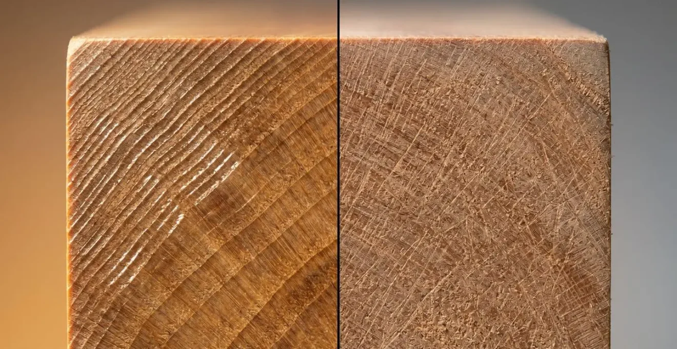
This is not an academic detail; it has huge practical implications for a set designer. A hand-planed floor, table, or wall panel will catch the stage lights with a vibrancy that makes the set feel dynamic and rich. A sanded surface will absorb that same light and appear flat. For a designer obsessed with atmosphere, understanding how to create and specify these living surfaces is a non-negotiable part of the craft.
Key Takeaways
- Narrative Curation Over Accumulation: A set’s reality comes from the significance of what remains, not the volume of what’s added. Remove anything that doesn’t serve the story.
- Emotional Materiality is Key: Translate abstract emotions into a physical language of texture, line, and mass. Surfaces and materials are silent actors.
- Design for the Audience’s Eye: Treat sightlines as a choreographic tool and surface finishes as a way to manipulate light, actively guiding the viewer’s experience.
Why Are West End Producers Now Hiring Robotics Engineers Alongside Choreographers?
The increasing presence of robotics engineers in the production teams of major West End and Broadway shows signals a fundamental shift in stagecraft. This isn’t about replacing human artistry with machines; it’s about integrating automation as a sophisticated tool for storytelling. The reason is simple: robotics and stage automation allow for a level of precision, fluidity, and spectacle that is impossible to achieve manually. This technology is being embraced because it enhances the narrative, creating seamless transitions and dynamic environments that become integral to the performance itself.
The demand for these immersive, high-quality productions is driving significant investment in the technology. In fact, according to one industry analysis, the global stage automation market is expected to grow at a compound annual growth rate of 5.0% from 2023 to 2028. This growth reflects a recognition that automation is not just a labour-saving device but a powerful artistic medium. It allows for scenes to morph and flow into one another without disruptive blackouts, maintaining the ‘stage magic’ and keeping the audience immersed in the world of the play.
Case Study: The Narrative Function of Automation in Disney’s ‘Frozen’
In the Broadway production of Disney’s *Frozen*, an intricate system of automated winches is used to create the illusion of Elsa’s ice magic, with swirls of snow and crystalline structures appearing to grow and move on their own. This example powerfully demonstrates how robotics serve the story. The fluidity of these automated transitions directly mirrors the character’s emotional journey and magical abilities. The technology eliminates the need for a large crew to manually handle complex scene changes, but more importantly, it achieves an artistic effect that enhances the narrative and would be impossible through conventional stagecraft.
For a set designer, this trend means thinking of the set not as a static object, but as a dynamic system. The collaboration between a robotics engineer and a choreographer is symbolic: the engineer provides the ‘how’ (the mechanical capability) while the choreographer provides the ‘why’ (the artistic and narrative timing). The set itself can now be choreographed. Walls can part, floors can rise, and furniture can glide into place with a grace and precision that becomes part of the performance’s dance. This is the next frontier of ‘narrative curation’—curating not just objects, but movement itself.
To put these principles into practice, the next logical step is to analyse your own design process, questioning every choice through the lens of narrative function and emotional impact.