Your visual effects feel fake not because you lack the right software, but because you’re missing the integration mindset. The key to believability isn’t in complex modelling or high-end render settings; it’s in the meticulous observation and replication of how light, materials, and camera lenses behave in the real world. This guide shifts your focus from the technical to the observational, providing the craft-focused principles needed to make your CGI elements feel truly present in the shot.
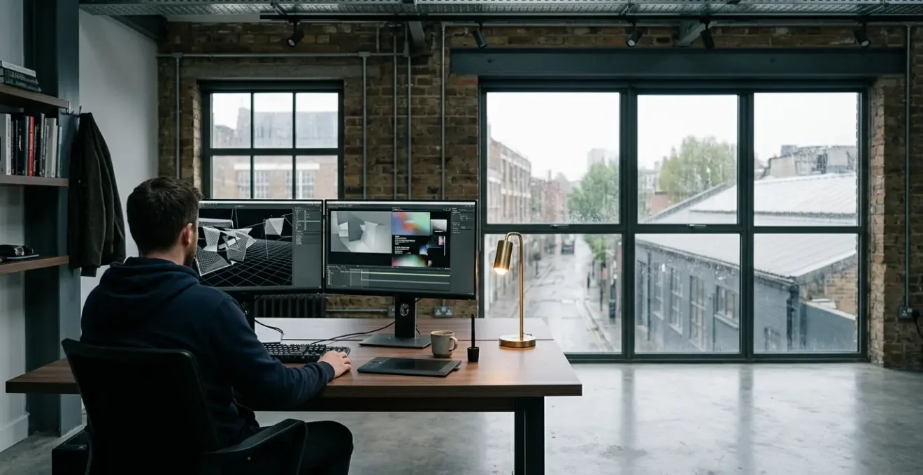
You’ve spent weeks modelling a perfect asset, hours texturing every detail, and days waiting for the render. You’re using the same software as the big London studios. Yet, when you composite your element into the plate photography, it just sits there—a sterile, digital object that screams « fake ». It’s a frustration every developing VFX artist knows intimately. The immediate impulse is to blame the tools, chase a new plugin, or simply increase the render samples, hoping brute force will solve the problem.
The common advice isn’t much help either: « get the lighting right, » « add imperfections, » « match the camera. » These platitudes are true but uselessly vague. They tell you the destination without providing a map. Getting the lighting « right » isn’t about adding more lights; it’s about understanding the nuances of light contamination and energy conservation. Adding « imperfections » isn’t about randomly slapping on a dirt map; it’s about telling a story with every scratch and smudge.
But what if the fundamental problem isn’t technical, but observational? The secret to the « Hollywood look » that seems so elusive isn’t hidden in proprietary software or a secret render setting. It’s a mindset—an obsession with deconstructing reality. It’s about training your eye to see not just the object, but the space it occupies, the light it reflects and absorbs, and the subtle « mistakes » of the camera that captured it. It is this integration-focused approach that truly sells a shot.
This article will deconstruct the core principles that separate amateur work from professional, integrated visual effects. We will move beyond the superficial advice and explore the underlying physics, artistry, and even the economics that contribute to a believable final image. Prepare to change not just how you work, but how you see.
Summary: Why Your Visual Effects Look Fake and How to Fix Them
- Why Does Your Perfect 3D Model Look Pasted Onto the Background?
- How to Study Real-World Light Behaviour to Improve CG Lighting Accuracy?
- Hyperrealistic CGI vs Stylised Rendering: Which Sustains Better Over Time?
- The Cloud Rendering Costs That Turned a Profitable Project into a Loss-Maker
- When to Push Back on Impossible Director Requests Before They Become Contractual?
- How to Master Just 5 Photoshop Tools to Enhance Scanned Paintings Effectively?
- Flats and Paint vs Projections: Which Creates More Impact for £15,000?
- Why Do Classically Trained Artists Fail Their First 3 Digital Projects?
Why Does Your Perfect 3D Model Look Pasted Onto the Background?
The most common failure in VFX integration is a psychological one. Your pristine 3D model, perfect in its isolation, lacks a shared history with the live-action plate. It hasn’t been subjected to the same light, the same atmosphere, or the same lens. It looks « pasted on » because it exists in a sterile digital vacuum, separate from the gritty reality of the scene. The goal isn’t just to place an object, but to convince the viewer’s subconscious that this object has always been there. The power of getting this right is immense; separate research shows that photorealistic rendering can increase perceived property value by 12-18%, a testament to how effectively CGI can fool the eye when integrated properly.
To bridge this gap, you must move from a modeller’s mindset to a compositor’s. Think about the « optical signature » of the camera. Every real camera lens introduces subtle distortions, chromatic aberration (colour fringing), and a specific depth-of-field falloff. Your CG camera must replicate these flaws perfectly. Furthermore, every real-world surface tells a story. Perfectly sharp edges and uniform textures are dead giveaways. This is where you practice surface storytelling—adding microscopic bevels that catch the light and using layered textures to show wear, dust, and handling. Your model shouldn’t just exist; it should have a past.
Ultimately, the final unifying element is grain or sensor noise. A perfectly clean CG element placed over grainy film or noisy digital footage will always feel disconnected. By sampling the noise from the plate and applying a matching layer to your CG, you are essentially « printing » your element onto the same digital « film stock » as the rest of the image. This final step is often the most critical in breaking the digital spell and creating a cohesive, believable frame.
Action Plan: The Integration Checklist
- Add subtle imperfections: Use noise maps or dirt maps to break up uniformity. Real-world surfaces have scratches, fingerprints, and variations in sheen that tell a story.
- Bevel all edges: Add small bevels (chamfers) to every edge of your 3D models. Perfectly sharp edges are a dead giveaway for CGI; bevels catch light naturally and add depth.
- Use HDRI lighting: High Dynamic Range Images capture 360-degree real-world lighting information, providing accurate environmental lighting and reflections for your CG elements.
- Match camera characteristics: Add depth of field, chromatic aberration, and subtle lens flares to mimic real DSLR photography and create a visual language your brain associates with real photographs.
- Apply film grain in post: High-quality CGI often looks too clean. Add a subtle layer of film grain or digital noise to make the image feel as though it was captured by a real camera sensor.
How to Study Real-World Light Behaviour to Improve CG Lighting Accuracy?
Lighting is the soul of integration. It’s not about the number of lights in your scene, but their quality and behaviour. The biggest mistake artists make is thinking of light as a direct beam from source to subject. In reality, light is a chaotic cascade of energy. It bounces, scatters, bleeds colour, and loses energy with every interaction. This phenomenon, « light contamination, » is what gives real-world scenes their richness and depth. A red wall will cast a subtle red hue onto the side of a white object placed near it. A bright sky will fill shadows with blue ambient light. Your CG lighting must replicate this messy, indirect behaviour to feel real.
The best way to learn this is to put down the mouse and pick up a camera—or just use your eyes. Set up simple still lifes. Place a white ball next to a coloured card and observe the colour bleed. Take it outside on an overcast day, characteristic of many UK-based productions, and notice the lack of sharp shadows and the soft, wraparound quality of the diffuse light. This is the light that defines the mood of so much British film and television. Understanding its properties is not optional; it’s essential for any artist working in this context.

This atmospheric quality is a perfect example of how light is shaped by its environment. The image above isn’t just about the light source (the sky); it’s about how that light is filtered and scattered by fog and haze. This creates tonal gradation and atmospheric perspective, where distant objects become less saturated and have lower contrast. Replicating this effect, where the air itself has substance, is a key technique for integrating CG elements into wide, exterior shots. Your digital assets must be subject to the same atmospheric laws as the real landscape they inhabit.
Hyperrealistic CGI vs Stylised Rendering: Which Sustains Better Over Time?
The relentless pursuit of photorealism can feel like the ultimate goal, but it’s a dangerous path. The « uncanny valley, » where something is almost real but just slightly off, is a treacherous place for any project. Furthermore, what looks perfectly photorealistic today can look dated in five years as technology and techniques evolve. This is where the strategic choice between hyperrealism and stylisation becomes a crucial artistic and commercial decision. While the global CGI market is currently valued at $35.5 billion with 6% annual growth, a significant portion of this is driven by work that doesn’t aim for perfect reality.
Stylised rendering often possesses a timeless quality. By abstracting reality, you create a cohesive visual language that isn’t judged by its fidelity to the real world, but by its own internal consistency and aesthetic appeal. Think of films like *Spider-Man: Into the Spider-Verse* or games like *Arcane*. Their look will never become « outdated » because they established their own rules. As Art Director Volodymyr Liubchuk notes, stylisation has other benefits:
Despite the dominance of 3D, 2D CGI Animation remains an important part of the industry due to production efficiency, stylistic flexibility, and lower technical requirements with no need for powerful render farms.
– Volodymyr Liubchuk, VSQUAD Studio – Art Director
This doesn’t mean photorealism is a flawed goal. For visual effects that must integrate seamlessly with live-action, it’s the only option. In architectural visualisation and product design, its ability to immerse a client in an unbuilt space is unparalleled. An analysis of property marketing found that while photorealism is excellent for immediate immersion, stylized designs often age more gracefully and do a better job of highlighting pure architectural form. The choice depends entirely on the project’s purpose. Is the goal to trick the eye for a fleeting moment or to create a lasting aesthetic statement?
The Cloud Rendering Costs That Turned a Profitable Project into a Loss-Maker
In the world of VFX, time is money, and rendering is time. The siren song of cloud rendering farms is powerful: near-infinite computing power on demand. For a small studio or freelancer, it’s the only way to tackle a heavy-duty shot. However, this power comes at a literal price, and without meticulous management, rendering costs can spiral out of control, eating an entire project’s profit margin. A single unoptimised scene, with excessive samples, high-resolution textures, and complex light bounces, can cost thousands of pounds to render over a weekend, often without the artist even realising the extent of the damage until the invoice arrives.
This is where economic realism becomes a core artistic skill. Before sending a single frame to the cloud, you must become a ruthless efficiency expert. Are your light samples optimised? Are your textures scaled appropriately for the final output resolution? Are you using render layers to isolate elements, so you don’t have to re-render the entire 20-hour shot because of a minor client note on a single asset? Every decision has a direct financial consequence. As the following data from a recent comparative analysis of render farms shows, prices can vary significantly, but they are never trivial.
| Render Farm | CPU Pricing | GPU Pricing | Free Trial | Storage Fees |
|---|---|---|---|---|
| FoxRenderFarm | $0.0306 per core/hour | $0.9 per hour (GPU node) | $25 credit | Included |
| RebusFarm | 1.40 cents per GHzh | 0.52 cents per OBh | 25 RenderPoints ($29.12) | No fees |
| iRender | Variable | From $9/hour (RTX 4090) | Available | Variable |
| GarageFarm | $0.024 per GHz/hour | $0.004 per OB/hour | Available | Variable by priority |
| AWS Deadline Cloud | Pay-as-you-go | Pay-as-you-go | No standing fees | $0 when idle |
The emergence of services like AWS Deadline Cloud highlights a shift in the industry towards more granular cost control. As Antony Passemard, AWS General Manager of Creative Tools, points out, « With Deadline Cloud you only pay for when you render. When you have downtime in your production, it costs you zero. » This model pressures artists to be even more strategic, optimising their workflows to minimise idle time and maximise rendering efficiency. Your ability to deliver a shot on budget is just as important as your ability to make it look beautiful.
When to Push Back on Impossible Director Requests Before They Become Contractual?
The relationship between a VFX supervisor and a director is a delicate dance between creative ambition and technical reality. The director’s job is to dream; your job is to make that dream a reality, on time and on budget. But sometimes, the dream is a physical impossibility or a financial black hole. Knowing when and how to push back is one of the most vital, and difficult, skills to learn. Failing to do so can lead to endless, uncompensated revisions and burnout, a reality reflected in a recent survey where client-side VFX workers reported that 58% work uncompensated overtime.
The first step is learning to translate « director-speak. » Directors often communicate in metaphor and emotion, not technical specifications. Bill Westenhofer, the VFX Supervisor on *Life of Pi*, famously recalled being asked to make a key scene look like « liquid gold. »
Translating the Metaphor
Rather than giving specifics, he would describe what he wanted in many scenes with creative metaphors. The direction I got for the scene where Pi sits on a mirror glass surface with dawn light spilling all around him was to make it like ‘liquid gold.’ – Bill Westenhofer, VFX Supervisor
This isn’t an impossible request; it’s an interpretive one. Your job is to break down « liquid gold » into its constituent technical parts: what is its viscosity, its refractive index, its luminosity, its colour palette? You push back not by saying « no, » but by presenting options: « Okay, to get that ‘liquid gold’ feel, we can try a high-viscosity fluid simulation with subsurface scattering, which will take two weeks to simulate. Or, we could approach it with a faster, more procedural shader network that will get us 90% of the way there in three days. Here are some visual tests. Which direction serves the story best? » This reframes the conversation from a ‘yes/no’ to a collaborative choice about time, budget, and creative priority.
The time to have these conversations is before the ink is dry on the contract. A pre-production meeting is not just an interview; it’s a negotiation. Before you even walk in, you should have read the script, researched the director’s previous work, and anticipated the most challenging sequences. By discussing methodology and potential pitfalls early, you can manage expectations and build trust. You establish yourself not as a button-pusher, but as a creative partner invested in finding the best way to tell the story within the project’s constraints.
How to Master Just 5 Photoshop Tools to Enhance Scanned Paintings Effectively?
Bringing a traditionally created piece of art, like a watercolour or oil painting, into the digital realm is more than just a high-resolution scan. A scanner is a dumb eye; it captures colour and form but loses the physicality of the original work. The texture of the canvas, the subtle thickness of the paint, the way light catches the ridges of a brushstroke—these are the elements that give the piece its life. The artist’s job in Photoshop is not to « correct » the image, but to resurrect this lost tactile quality.
Instead of getting lost in hundreds of filters and adjustments, you can achieve 90% of a professional enhancement by mastering just five core tools. First, the Levels or Curves adjustment is your primary tool for restoring contrast. A scan is often flat and grey; a simple S-curve can bring back the deep blacks and bright whites without clipping detail. Second, the Color Balance tool allows you to correct the scanner’s colour cast, gently nudging the midtones, highlights, and shadows back to the original’s true hue. Third, a subtle Unsharp Mask, used carefully, can re-introduce the micro-details of the paper or canvas texture that were softened by the scanning process.

Fourth, and most critically, is the use of layer masks with soft brushes. Instead of making global changes, you can selectively paint in adjustments, enhancing the vibrancy of one colour or dodging and burning specific areas to guide the viewer’s eye, mimicking how a real-world gallery light might highlight a piece. Finally, a texture overlay, using a high-resolution photo of canvas or paper set to a blend mode like ‘Soft Light’ or ‘Overlay’ at a very low opacity (1-5%), can reintroduce a tangible, physical surface to the flat digital file. This macro detail, as seen in the image above, is the very essence of what makes a physical painting feel real.
Flats and Paint vs Projections: Which Creates More Impact for £15,000?
In the world of theatre, events, and smaller-scale film productions, budget is king. A £15,000 budget for a background environment is substantial enough to offer a real choice: do you invest in the tangible, physical craft of painted flats, or the dynamic, technological potential of projection mapping? The answer isn’t about which is « better, » but which delivers the most impact for the specific story being told. This is a classic battle between static, reliable artistry and dynamic, flexible technology.
Let’s break down the budget. With £15,000 for painted flats, the bulk of the cost is in labour and materials. This could buy you several large, meticulously detailed scenic backdrops, crafted by skilled scenic artists. The advantages are clear: the result is tangible, has a beautiful material quality, and is completely reliable—it won’t suffer from projector failure or ambient light washing it out. The impact is one of texture, permanence, and traditional craftsmanship. However, it is completely static. If you need the environment to change, you need another flat.
Conversely, that same £15,000 for projections is almost entirely a hardware and content creation cost. It could cover the rental of one or two high-lumen projectors, a media server for playback, and the artist hours to create the digital content. The impact here is dynamism. You can transport an audience from a forest to a cityscape in a second. You can have weather effects, moving elements, and interactive backgrounds. The downside is the vulnerability to ambient light—it requires a highly controlled lighting environment to work effectively—and the risk of technical failure. The aesthetic is often smoother and more ethereal, lacking the physical « tooth » of a painted canvas.
The decision comes down to narrative function. Does the background need to be a solid, believable, but unchanging world? Go with paint. Does the environment need to evolve, react, or transport the audience through multiple locations? Projections are the clear winner. For £15,000, you are not just buying a background; you are investing in either steadfast physical beauty or fluid digital storytelling.
Key Takeaways
- Integration over Isolation: A perfect model is useless if it doesn’t share the same light, atmosphere, and camera flaws as the live-action plate.
- Observe Before You Create: The secret to believable lighting and materials isn’t in the software settings, but in the meticulous study of real-world physics and imperfections.
- Embrace Economic Realism: Your ability to manage render costs and client expectations is as critical to your success as your artistic skill.
- Artistry Defines Tools: The goal is not just photorealism. Stylisation can be a more powerful and timeless choice, and traditional skills are fundamental even in a digital world.
Why Do Classically Trained Artists Fail Their First 3 Digital Projects?
A classically trained painter or sculptor stepping into the digital world for the first time often faces a crisis of confidence. Despite years of mastering anatomy, composition, and colour theory, their initial digital creations feel lifeless and clunky. The reason for this failure rarely lies in a lack of artistic talent, but in a fundamental misunderstanding of the medium. They are trying to use a computer as if it were a pencil, not realising that the digital canvas has its own language, physics, and workflow.
The core issue is the « undo » paradox. In traditional art, every mark is a commitment. A brushstroke has weight and consequence, forcing discipline and foresight. The digital realm, with its infinite undos and non-destructive layers, can paradoxically lead to hesitant, overworked, and indecisive art. The artist, freed from consequence, noodles endlessly, losing the confident energy that defined their physical work. They must learn to re-introduce commitment, perhaps by setting a limited number of undos or working on a single flattened layer to force decision-making.
A History of Transition
The entire history of CGI is a story of this transition. The very first computer-generated animation, a 10-second clip of Ed Catmull’s hand from 1972, was a technical experiment that laid the groundwork for an industry. But the real shift happened with *Toy Story* in 1995. The rapid adoption of CGI, growing from 50% of animated films in 2000 to 90% by 2009, forced a generation of traditional artists to adapt or become obsolete. This history shows that the challenge is not new; it’s a fundamental part of the medium’s evolution.
Another major hurdle is the disconnect from physicality. A traditional artist understands their materials intimately—the viscosity of paint, the tooth of the paper. A digital artist must learn a new set of physical properties: brush algorithms, pressure sensitivity curves, and layer blend modes. They must learn that a « hard round » brush and a « soft airbrush » are not just different tools, but different physical concepts. The failure of the first few projects is a necessary part of this translation process—the period where the artist learns to map their deep-seated artistic knowledge onto a completely new set of digital muscles.
As Volodymyr Liubchuk, Art Director at VSQUAD Studio, states, the principles remain the same even if the tools change: « Technology continues to advance, making CGI computer animation more accessible. However, creativity and technical expertise remain essential… the success of a project depends on understanding goals, audience, and proper use of available tools. » The classically trained artist already has the most important skills. Their initial « failures » are not a sign of incompetence, but the painful, necessary first steps of learning a new creative language.
Start applying this observational mindset to your very next shot. The journey to creating believable, integrated visual effects begins not in the software, but in how you train yourself to see the world. That is the craft.