The common failure of classically trained artists in digital art isn’t a lack of skill, but a misunderstanding of how to translate their physical intuition into a non-linear, non-physical medium.
- Your knowledge of colour theory is valid, but it’s clashing with the physics of screen-based light (RGB) versus pigment (CMYK).
- Success isn’t about mastering every tool, but adopting a small, non-destructive workflow that protects your original vision.
Recommendation: Stop trying to learn software like a technician. Instead, focus on building a bridge between your existing artistic ‘muscle memory’ and the specific digital tools that honour it.
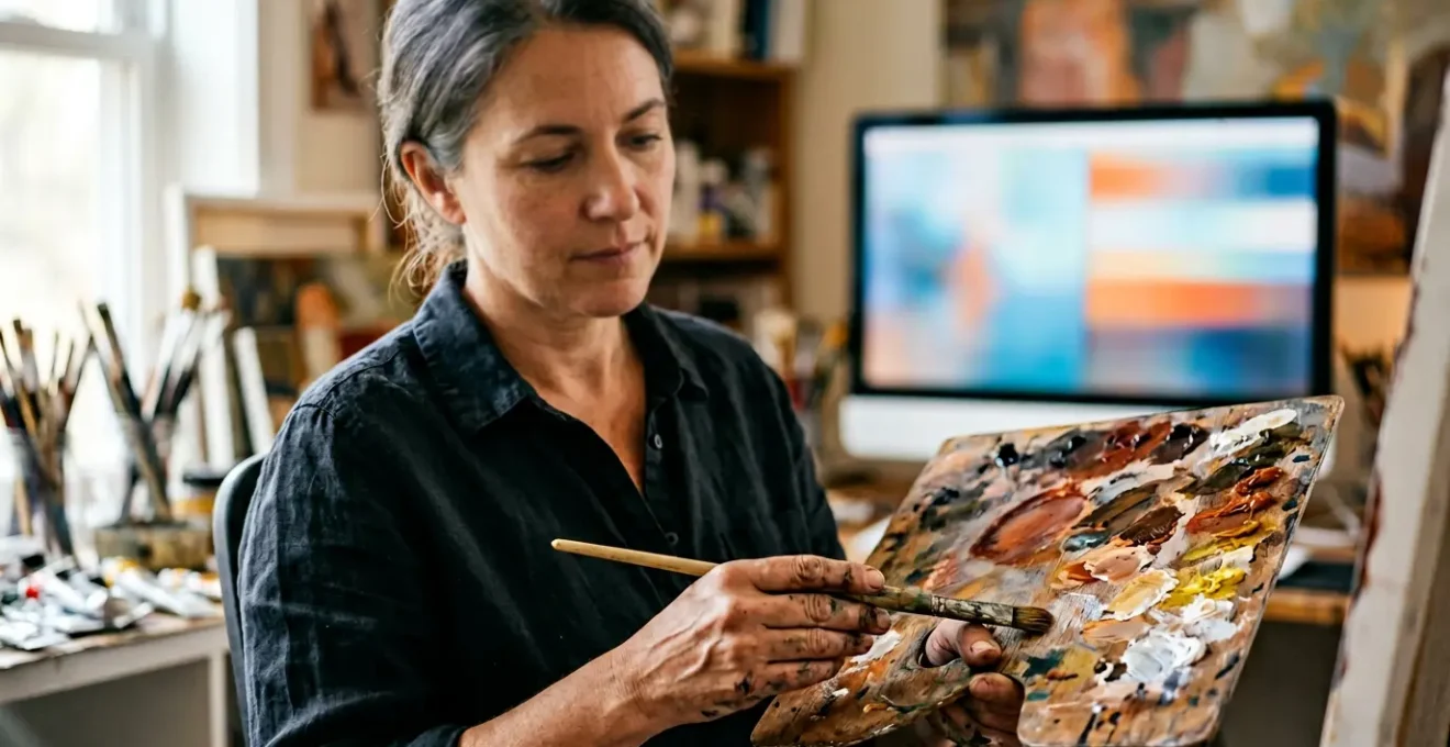
You’ve spent years, perhaps decades, honing your craft. You understand the subtle shift of chiaroscuro, the precise feel of a loaded brush on canvas, and you can mix any colour from memory. Your hands and eyes work in perfect unison. So, why does opening a program like Photoshop for the first time feel like an admission of defeat? Why does the infinite potential of the digital canvas feel more paralyzing than liberating? Many classically trained artists stumble here, believing their hard-won skills have suddenly become obsolete. They get lost in endless menus and tutorials, trying to master a tool they fundamentally resent.
The common advice to « just practice » or that « it’s just another tool » is dismissive. It ignores the core of the problem. This isn’t a failure of talent or discipline. It’s a crisis of translation. The disconnect you feel is real, and it stems from a fundamental conflict between the physical, linear world of paint and the virtual, non-linear world of pixels. Your artistic ‘muscle memory’ is trying to operate in an environment with entirely different physical laws.
But what if the solution wasn’t to abandon your intuition and start from zero? What if, instead, the key was to consciously translate your existing mastery into this new language? This guide is built on that premise. We will not be listing every tool or feature. Instead, we will address the precise points of friction that trip up talented artists like you. We will explore why your colour expertise seems to fail you, how to select a mere handful of tools to achieve professional results, and how to make the digital workflow finally feel like an extension of your own hand, not a barrier to it.
This article will guide you through the specific challenges and mindset shifts required to bridge the gap between your traditional skills and digital production. We’ll break down the technical barriers and psychological hurdles to help you find your voice on the digital canvas.
Summary: From Traditional Skill to Digital Mastery
- Why Does Photoshop Feel Alienating When You Already Understand Colour Theory?
- How to Master Just 5 Photoshop Tools to Enhance Scanned Paintings Effectively?
- Wacom vs iPad Pro: Which Feels More Like Traditional Drawing for Fine Artists?
- The Monitor Setting That Makes 70% of Artist Prints Look Dull Compared to Screen
- When to Allocate Software Learning: Dedicated Weeks or 30-Minute Daily Slots?
- How to Add Projection Mapping to Your Canvas Work Without Losing Painterly Integrity?
- Why Does Every Midjourney User’s Portfolio Look Identical After 6 Months?
- Why Do Your AI-Assisted Artworks Look Like Everyone Else’s AI Art?
Why Does Photoshop Feel Alienating When You Already Understand Colour Theory?
Your frustration with digital colour is completely valid. You know how to mix a perfect cerulean blue with pigment, but the same process on a screen yields a muddy, unsatisfying result. This isn’t a failure of your eye; it’s a collision of two different physics models. Traditional painting operates on the CMYK subtractive colour model, where pigments are mixed and light is absorbed. The more colour you add, the darker it gets. Your screen, however, operates on the RGB additive colour model, where red, green, and blue light are combined. The more light you add, the closer you get to white. Your entire intuitive understanding of colour mixing is being turned on its head.
This is the primary source of alienation. You are no longer mixing paint; you are manipulating light. The tools in Photoshop, like the Hue/Saturation sliders and Colour Balance adjustments, are designed to control the properties of this light. Thinking of them as digital equivalents to adding a dab of white paint or a drop of water is a category error that leads to confusion. The goal is to start thinking like a lighting designer, not just a painter.
Furthermore, the moment you decide to print your digital work, you re-enter the world of CMYK. This conversion process is where many artists feel betrayed by their screens. As artist Mary Li explains in her analysis of colour theory, this shift is often reductive.
RGB colours have a wider colour range than CMYK colours, thus converting a digital artwork from RGB to CMYK will result in colours becoming flatter/duller.
– Mary Li, RGB versus CMYK Color Theory
Understanding this is the first step. You must consciously accept that you are working in two different colour spaces: a vibrant, light-based one for the screen (RGB) and a more constrained, pigment-based one for print (CMYK). The key is not to fight this, but to learn how to manage the translation between them using tools like soft-proofing, which we’ll cover later.
How to Master Just 5 Photoshop Tools to Enhance Scanned Paintings Effectively?
The temptation when opening Photoshop is to learn everything. The endless toolbars and menus suggest that mastery requires encyclopedic knowledge. This is a trap. For a traditional artist looking to digitize scanned work, 95% of those tools are irrelevant. The key is to adopt a minimalist, non-destructive workflow that respects and enhances your original piece, rather than obliterating it.
A non-destructive workflow means you never permanently alter the pixels of your original scan. Instead, you work with adjustment layers, filters, and masks that act like transparent sheets laid over your artwork. You can edit, adjust, or completely remove them at any time. This preserves the integrity of your original scan and frees you from the fear of making an irreversible mistake—a major source of anxiety for those used to the finality of physical media. This approach focuses on subtle enhancements: correcting scanner colour casts, boosting contrast, and cleaning up dust, all while preserving the crucial texture of your paper or canvas.
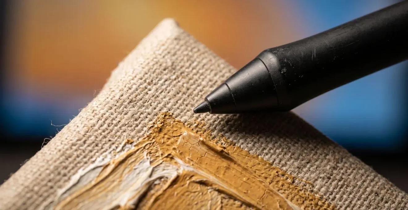
As the image above illustrates, the goal is to work *with* the physical texture, not against it. By focusing on a few select tools, you build a powerful, repeatable process that becomes second nature. It’s not about learning Photoshop; it’s about building a digital finishing studio for your physical work. The following checklist outlines a complete, non-destructive process using only a handful of core functions.
Action Plan: A 5-Step Non-Destructive Workflow for Scanned Art
- Initial Correction (Camera RAW Filter): Apply global, reversible adjustments to exposure and colour balance without permanently altering the original scan. This is your digital ‘darkroom’ for the initial setup.
- Tonal Refinement (Adjustment Layers): Use non-destructive Levels or Curves layers to fine-tune the tonal range and contrast. This preserves your ability to re-edit endlessly.
- Blemish Removal (Healing Brush): Remove dust and scanning artifacts while intelligently preserving underlying canvas texture. Avoid the Clone Stamp, which often flattens and creates repetitive patterns.
- Texture Sharpening (High Pass Filter): Subtly sharpen the canvas or paper texture by creating a separate layer that isolates high-frequency details from colour information.
- Targeted Edits (Layer Masks): Apply any of the above adjustments to specific areas of the image. This gives you full control and reversibility, mimicking the precision of your physical brushwork.
Wacom vs iPad Pro: Which Feels More Like Traditional Drawing for Fine Artists?
One of the biggest hurdles in transitioning to digital is the tactile disconnect. The feeling of a plastic nib gliding on a glass screen is nothing like the satisfying friction of charcoal on textured paper. Choosing the right hardware is about minimizing this disconnect and finding a tool that best translates your existing artistic muscle memory. The two main contenders, Wacom and the iPad Pro, offer fundamentally different philosophies on this front.
Wacom, the long-standing industry standard, has built its reputation on precision and customisation. Its screenless Intuos tablets force you to develop hand-eye coordination between the tablet surface and the monitor, which some find unnatural. Their Cintiq display tablets, where you draw directly on the screen, are much closer to a traditional experience. Wacom’s strength lies in its pen technology, with thousands of pressure levels and customizable nibs that can simulate the « tooth » of paper. In contrast, the iPad Pro with the Apple Pencil prioritizes a feeling of immediacy and naturalness. As one professional artist from Art Side of Life notes, the freedom of the tool is paramount.
The Apple Pencil feels like I can do whatever I want. I change my grip, holding method, angle, speed, pressure, and technique without thinking about it, and I can much more easily get lost in creating.
– Professional artist reviewer, Wacom vs iPad Pro comparison review, Art Side of Life
This highlights the core difference: Wacom often feels like a technical instrument, whereas the iPad Pro feels more like a sketchbook. There is no single « best » option; the choice depends on your artistic priorities. Do you value the granular control and professional-grade customisation of a Wacom, or the portable, intuitive, and spontaneous feel of an iPad? This table breaks down the tactile experience for a traditional artist.
| Feature | Wacom (Intuos Pro / Cintiq) | iPad Pro + Apple Pencil |
|---|---|---|
| Surface Texture | Etched glass creates paper-like resistance and sound, customizable with felt nibs for ‘toothy’ feel | Glossy glass with ‘glassy glide’ (can add Paperlike protector for friction, though it dulls colors) |
| Pressure Sensitivity | Up to 8,192 levels (Wacom Pro Pen 2), highly customizable pressure curves | Tilt and pressure sensitive, limited curve customization compared to Wacom |
| Parallax | Minimal on Cintiq models, non-existent on pen tablets (screenless) | Laminated screen eliminates parallax on Pro models |
| Ergonomics | Pen designed for technical precision, may feel restrictive for varied grip styles | Natural pencil-like feel, supports spontaneous grip changes and artistic freedom |
| Portability | Pen tablets: portable but require computer. Cintiq: requires external power and computer connection | Fully standalone, battery lasts up to 10 hours, ideal for mobile sketching |
| This comparative data is compiled from multiple artist reviews. | ||
The Monitor Setting That Makes 70% of Artist Prints Look Dull Compared to Screen
Here is one of the most painful moments for a digital novice: you spend hours perfecting the colours on a piece, only for the print to come back from the lab looking flat, dark, and lifeless. The vibrant image on your screen has been betrayed. This isn’t the print lab’s fault. The culprit is almost certainly your monitor’s factory settings, which are designed for watching movies and browsing the web, not for professional colour work.
Specifically, out-of-the-box monitors are far too bright. A backlit screen is an active light source, while a piece of paper is a passive, reflective surface. Your screen is shouting with light, while the print can only whisper back what the ambient light allows. Professional print calibration guidelines show that factory monitor brightness can exceed the luminance of paper by a staggering 400% or more. This single setting creates a massive gap between what you see and what you get. You are essentially painting with a lightbulb and expecting it to look the same when printed on paper.
To bridge this gap, you need to calibrate your monitor for print. This sounds technical, but it boils down to three key adjustments. While a hardware calibrator like a Datacolor SpyderX is the gold standard for accuracy, you can make significant improvements by manually adjusting your monitor settings. The goal is to make your monitor behave less like a television and more like a high-quality, illuminated sheet of fine art paper.
- Set Luminance to 100-120 cd/m²: This is the most crucial step. Reduce your monitor’s brightness, which is often set at 200-300 cd/m² by default, to match the reflective brightness of paper under gallery lighting.
- Adjust White Point to 5500K: Most monitors default to a « cool » white of 6500K, which has a blueish tint. Shifting to a warmer 5500K (often called D55) will more accurately match the colour temperature of most fine art papers and prevent prints from appearing unexpectedly yellow.
- Enable Soft-Proofing with ICC Profiles: This is a function within Photoshop that simulates how your image will look on a specific printer and paper combination. Your print lab will provide these « ICC profiles » for download (e.g., for Hahnemühle Photo Rag). Using this allows you to preview and adjust for the RGB-to-CMYK colour shift before you ever send the file to print. A guide from a fine art printer can walk you through this process.
When to Allocate Software Learning: Dedicated Weeks or 30-Minute Daily Slots?
The conventional wisdom for learning any new skill is « consistency is key, » often interpreted as rigid, daily practice. For a creative professional, this advice is incomplete. Learning a complex tool like Photoshop involves two different types of cognition: the deep, immersive problem-solving of a creative flow state, and the rote memorization of tool functions and shortcuts, which builds muscle memory. A learning strategy that ignores this distinction is inefficient and can lead to burnout.
Forcing yourself into a 30-minute daily slot to « be creative » is often counterproductive. Creative breakthroughs happen during longer, uninterrupted sessions where you can get lost in a project. Conversely, trying to memorize a dozen keyboard shortcuts during an intense creative session breaks your flow and pulls you out of the work. The most effective approach is a hybrid one that allocates different types of time for different types of learning.
This strategy, advocated by many digital art educators, involves dedicating larger blocks of time to project-based work and using short, daily sessions for targeted technical drills. For example, you might set aside a full weekend to complete a single project from start to finish, like digitally colouring a scanned ink drawing. This immersive experience provides context and purpose to the tools you’re using. Then, during the week, you can use 20-30 minute slots each day to master one specific tool used in that project (e.g., « Monday: practice with the Healing Brush »). This builds your technical library without the pressure of being creative on demand.
- Dedicated Blocks (Flow State): Use multi-hour sessions or even full days/weeks to complete tangible projects. This is where you solve creative problems and learn how tools interact in a real-world context.
- Micro-Slots (Muscle Memory): Use short, daily 20-30 minute sessions for rote practice. Focus on one tool, one technique, or a set of keyboard shortcuts. This is about building automaticity.
- Weekly Review: At the end of the week, assess which tools felt intuitive and which felt clumsy. Use this insight to plan your micro-slots for the following week, turning weaknesses into strengths.
How to Add Projection Mapping to Your Canvas Work Without Losing Painterly Integrity?
As you grow more comfortable with digital tools, you might be tempted to explore more advanced integrations, such as projection mapping onto your physical canvases. This can be a powerful way to create dynamic, living artworks, but it also carries a significant risk: the digital projection can easily overwhelm and flatten the physical piece, turning your textured painting into little more than a uniquely shaped movie screen. The key to success is to maintain your painterly integrity.
Think of the projection not as a separate video, but as a final, luminous « glaze » of paint. Your goal is for the light to interact with the physical properties of your canvas—the texture of the weave, the ridges of impasto, the subtle sheen of varnish. To achieve this, you must move beyond simply pointing a projector at a painting. The real artistry happens in the software used to create the projection, like MadMapper or Resolume.
Instead of projecting a solid, opaque video, work with simple shapes, gradients, and lines. Use low opacity and blending modes (like ‘Screen’, ‘Overlay’, or ‘Add’) to allow the physical painting’s colours and textures to show through. Create digital masks that align with the shapes in your painting, allowing you to selectively illuminate or animate certain areas while leaving others untouched. For example, you could project a slow, shimmering light that only appears on the highlights you’ve physically painted, making them pulse with an inner life. The projection should feel like it’s emerging from the canvas, not being slapped on top of it.
The most successful examples of this hybrid art form occur when there is a dialogue between the physical and the digital. The static, tactile certainty of the paint is enhanced by the ephemeral, dynamic nature of the light. It’s a delicate balance, but when achieved, it elevates the work beyond either medium alone. It becomes a true synthesis of your traditional hand and your new digital control.
Why Does Every Midjourney User’s Portfolio Look Identical After 6 Months?
As you explore the digital landscape, you’ll inevitably encounter the world of AI image generation. Tools like Midjourney offer a seductive promise: the ability to create complex, detailed images from a simple text prompt. However, after a few months of use, a strange phenomenon occurs. Despite the infinite possibilities, many users’ portfolios begin to look strikingly similar. They are filled with the same hyper-detailed, glossy, and often compositionally centered images—the « Midjourney aesthetic. »
This homogeneity isn’t an accident; it’s a feature of the system. The AI model is not a neutral tool. It has been trained on a vast dataset of images from the internet, and it has inherent biases towards styles, subjects, and compositions that are most common in that data. When you enter a simple prompt, the AI defaults to the most statistically probable—and therefore most generic—interpretation of that prompt. It’s designed to deliver a « successful » and impressive-looking image with the least amount of effort from the user.
The result is the trap of the default style. Users learn which keywords (`–v 6.0`, `cinematic`, `hyperrealistic`, `8k`) produce the most polished results, and they begin to overuse them. The algorithm rewards this behaviour by delivering consistently « good » images, and the artist’s unique voice is slowly eroded. They are no longer directing the art; they are merely curating the most pleasing outputs of the machine’s preconceived notions. This creates a feedback loop where portfolios converge on a shared, algorithmically-defined aesthetic that is impressive at first glance but ultimately lacks personal vision or soul.
Breaking out of this requires a conscious effort to fight against the platform’s defaults. It means using intentionally strange or « bad » prompts, pushing the system into uncomfortable territory, and, most importantly, seeing the AI’s output as raw material, not a finished product.
Key Takeaways
- The frustration with digital tools is a translation problem, not a skill problem. Your core artistic knowledge is still valid.
- Focus on a non-destructive workflow with a few key tools to preserve your work’s integrity and reduce anxiety.
- Calibrating your monitor for print (especially brightness) is non-negotiable to bridge the gap between screen and reality.
- The key to unique AI-assisted art is to use AI for generating raw materials, then apply your own artistic vision in a separate editing stage.
Why Do Your AI-Assisted Artworks Look Like Everyone Else’s AI Art?
The problem of aesthetic homogeneity extends beyond Midjourney to all AI art tools. The reason your AI-assisted work might look generic is that the tool is optimizing for the prompt, not for your artistic intent. An AI model is a powerful collaborator but a terrible art director. It lacks personal history, emotion, and a point of view. It can generate technically flawless components, but it cannot arrange them with meaning. That final, crucial step still belongs to the artist.
The path to creating unique AI-assisted art is to reclaim your role as the ultimate arbiter of composition, colour, and emotion. This means fundamentally shifting how you use these tools. Instead of trying to perfect a single image within the AI generator (a process called « prompt-bashing »), you should use it as an engine for generating raw materials—textures, characters, lighting environments, abstract forms—and then export those assets into your primary digital workspace, like Photoshop.
This is the final and most important « workflow translation. » Here, in a familiar environment, you can composite different AI-generated elements, integrate them with your own scanned drawings or textures, and apply the non-destructive editing techniques you’ve learned. You can use layer masks to blend a generated sky with your own painted foreground. You can use adjustment layers to force the AI’s generic colour palette to conform to your personal aesthetic. You are no longer at the mercy of the algorithm; you are using its outputs as another form of paint. This is how you infuse AI-generated content with your unique authorial voice.
Ultimately, your art will look like your art, not « AI art, » when your hand and your eye are the last things to touch the piece. The AI can be an incredible assistant for ideation and asset generation, but the composition, the storytelling, and the soul of the work must remain yours. It is the synthesis of machine-generated potential and human-driven intention that creates something truly new and personal.
By treating digital tools and even AI as collaborators to be directed by your established artistic vision, you can successfully navigate this transition. Your skills are not obsolete; they are the very foundation that will give your digital and hybrid work a depth and integrity that technology alone can never replicate.